A landing page is your brand’s first impression and a powerful conversion tool. It’s designed to lead visitors to take a specific action, whether that’s signing up, purchasing, or subscribing. But not all landing pages are created equal; the most effective ones are built with key elements that create seamless user experiences and guide visitors toward taking that desired action.
Let’s break down the essential elements and see how you can use each one effectively.
1. Clear, Actionable Headline
The headline is the first thing visitors notice, so it must be concise, engaging, and actionable. A great headline tells visitors exactly what they stand to gain.
Example: For a meal-prep service something like: “Save Time and Eat Healthy with Fresh, Pre-Made Meals Delivered to Your Door”
Why It Works: It’s clear and targeted, telling the visitor what they can expect and why they should care.
2. Persuasive Sub-headline
While the headline grabs attention, the sub headline should reinforce your unique value proposition. A well-crafted sub headline explains your offer in more detail and connects with the user’s needs.
Example: “Customizable meal plans designed to fit your diet and lifestyle, so you never have to worry about meal prep again.”
3. High-Quality Visuals
High-quality images or videos make your offer more tangible and relatable. Show images of your product in action, customer testimonials, or even a video explainer to demonstrate your product’s benefits.
Tip: Avoid using stock photos; instead, show your product, team, or customer stories whenever possible.
4. Concise, Compelling Copy
Landing page copy needs to be concise and focused on benefits, not just features. Users should understand exactly how your product or service will improve their lives.
Focus on Benefits over Features: Instead of just listing “Weekly Recipes,” try “Never stress about meal planning with weekly recipes that fit your busy schedule.”
Tip: Break up the text into bullet points and short paragraphs, keeping it easy to skim.
5. Strong, Clear Call to Action (CTA)
Your CTA button is the heart of your landing page and should stand out visually while containing an action-oriented phrase. Use colors and positioning that make the button prominent but not intrusive.
Examples of Effective CTAs:
-
- Get Started Now
-
- Claim Your Free Trial
-
- Start Saving Time Today
6. Social Proof and Trust Signals
Social proof (testimonials, reviews, or media mentions) builds trust with potential customers. Trust signals such as security badges or customer testimonials show credibility and reduce uncertainty.
Case Study: Dropbox’s landing page includes reviews and social proof elements from recognized sources, establishing trust with new users.
Tip: Consider embedding testimonials with real names and photos for authenticity.
7. Minimal Navigation
A landing page should have minimal navigation. The focus should be on driving users toward your CTA without distraction. Consider removing the main menu, footer links, and other navigational elements.
Why It Works: By reducing options, you create a more focused experience that guides users toward the desired action.
8. Mobile Optimization
Many users access landing pages on their mobile devices, so your design must be mobile-friendly. Ensure that all elements are responsive and that CTA buttons are easy to tap on a mobile screen.
Tip: Test your landing page on different devices to make sure it’s fully optimized.
9. Fast Load Speed
Load speed significantly affects user experience and conversions. A slow page can lead to higher bounce rates, so make sure your landing page loads quickly.
Stat: Google data shows that pages taking longer than three seconds to load experience a 32% increase in bounce rate.
10. Simple Lead Capture Form
If your goal is to collect leads, a short form with minimal fields can improve conversions. Ask for only essential information, and if possible, use progressive profiling so that future visits reveal more details.
Example: Instead of “Name, Email, Phone, Job Title,” just start with “Email” and “Name.” You can collect additional information later.
Case Study: Slack’s Landing Page Success
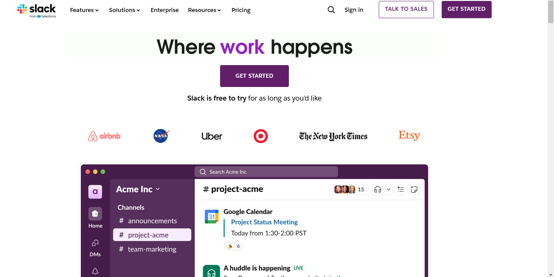
Background: Slack, the popular messaging platform, launched a simple, conversion-focused landing page to attract teams and organizations.
Elements that Worked for Slack:
-
- Straightforward Headline: “Where Work Happens.”
- Concise Copy: Clear messaging about Slack’s benefits for team productivity.
- Effective CTA: A prominent “Get Started” button led visitors directly to sign-up.
- Minimal Navigation: No main navigation or extra links.
- Social Proof: User testimonials from well-known brands.
Results: Slack’s approach increased its conversions, and the company grew exponentially as more teams adopted its platform.
FAQs
1. What makes a landing page different from a homepage?
Landing pages are specific to one goal, with minimal navigation and a clear CTA, while a homepage serves as an overview of a website’s offerings.
2. How long should my landing page copy be?
Aim for short, concise copy. Include only the most essential points and focus on benefits rather than features.
3. What’s the ideal CTA color?
There’s no one-size-fits-all color, but it should contrast with your background and stand out visually.
4. Should I use pop-ups on my landing page?
Use pop-ups sparingly, like exit-intent pop-ups, as they can improve conversion without interrupting the user experience.
5. How do I know if my landing page is working?
Use metrics like conversion rate, bounce rate, and user engagement to gauge effectiveness, and test different versions to see what works best.
Conclusion
A high-converting landing page is more than just an online brochure. It’s a powerful tool for turning visitors into customers by guiding them along a seamless path. By using clear headlines, concise copy, compelling CTAs, and authentic social proof, you can create a landing page that drives conversions and builds trust.